Rome Is Beautiful – A Glory To Rome Unboxing
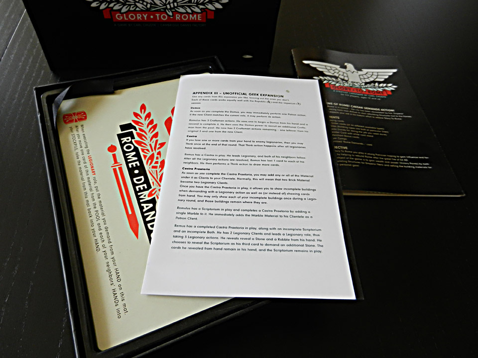
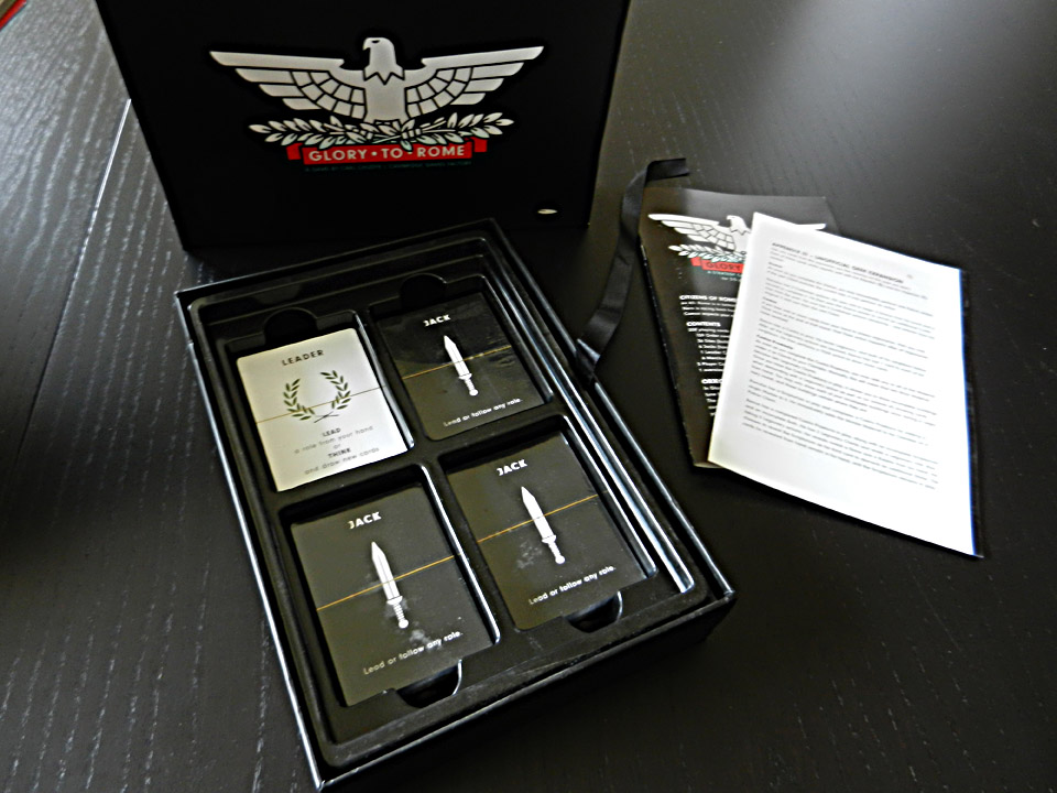
You won’t often find many unboxing posts around Dice Hate Me, but every now and then a game comes along that warrants a little more attention to component detail. Glory to Rome is definitely one of those games. Since most of us have waited a cesar’s lifespan to get the game, and because I’ve received several questions about the game’s components, I now present a pictorial overview of the innards of one unbelievably beautiful black box.
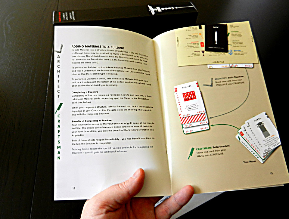
As you can see, the rules are clean, beautiful and magnificently displayed. Easy-to-follow full-page diagrams make learning the game much easier.
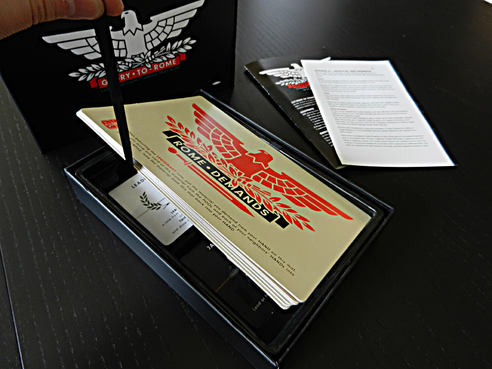
There's a fancy ribbon pulltab that makes lifting the tableaus to get to the cards a cinch. It also prevents tableau edge chipping from fingernails while trying to get them out of the box.
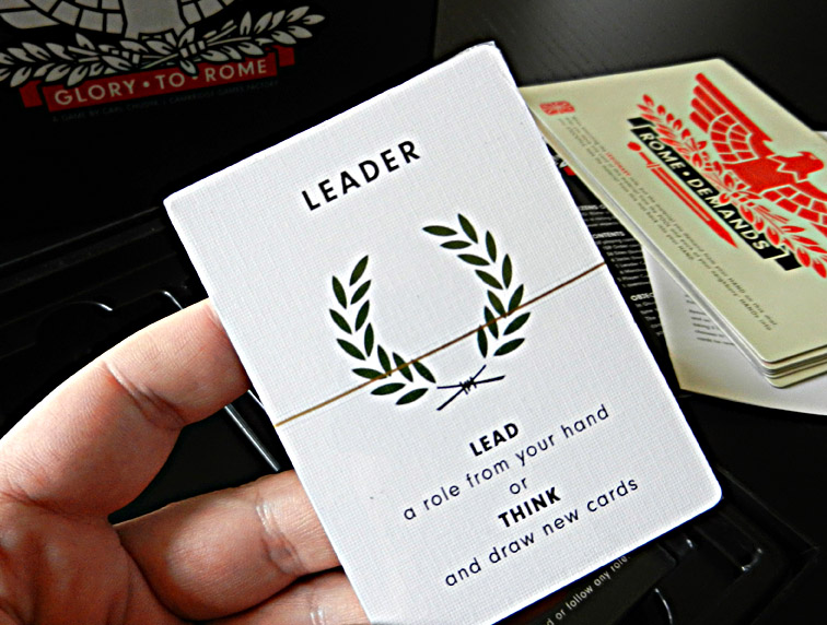
The card wrappers have a pulltab, as well. We love when publishers do this and requested it for our production of Carnival.

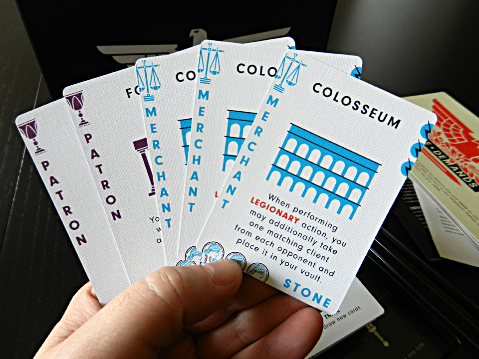
A close-up of the fairly unique linen embossing. The card stock is superb and there is no noticeable humidity warping.

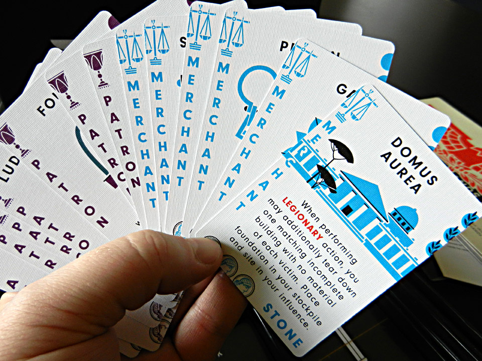
A few of the cards from the Plato3000 card game that backers receive as a bonus. The art and design on this is fantastic!
Related posts:
- Origins 2012 Photo Recap – A Publisher’s Perspective
- The State of Games, Episode 23 – The One About the Unpublished Masses
- Origins Game Fair 2011: Day 3
- A Particularly Scottish View of Essen Spiel
- The State of Games, Episode 10 – The One About Origins
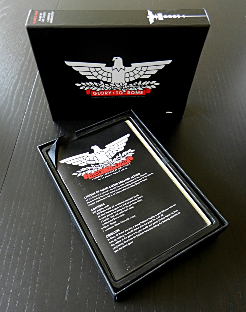



My word that is lovely.
Isn’t it, though? Breathtaking.
RE: “Since most of us have waited a cesar’s lifespan to get the game…”
Chris, you really know how to turn a phrase. At least the wait will have been worth it. Those cards look great. Very interesting detail on the embossing.
Drooooooool!
This version looks way better than the original, but, unfortunately, it’s not even close to french and polish versions graphic-wise. I did not have the french one in my hands, but to be onest – the cards in polish one are not as thick (still, they are very good) – all in all – I’d choose the polish version, but for the english-speaking people, the language barrier would probably be too high…
Keen-eyed observers will note the similarity of the Glory to Rome card styling and the cards in the classic ’70s-era version of Mille Bornes: http://cf.geekdo-images.com/images/pic236390_md.jpg
its possible…. i preferred the old art. this is a little boring. great game though.